

The Problem: New Startup vs. Established Giants
The interactive fiction market is dominated by established giants, setting a high bar for visual fidelity and engaging narratives. Our startup needed to break into this saturated space with a Minimum Viable Product (MVP) that didn't feel like an MVP. The challenge was to deliver a premium, polished user experience that rivalled top-tier competitors, all while operating with the lean resources, limited headcount, and accelerated timelines of an early-stage company.
The Goal: Scaling Quality with Lean Resources
To design and execute a lean, scalable production pipeline that could deliver high-fidelity content rapidly. My goal was to establish a distinct visual language and intuitive user interface that maximized our limited resources, ensuring that every screen, character illustration, and dialogue line contributed to a cohesive, high-retention experience that could compete with market leaders.
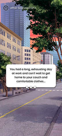
Interactive Stories is a mobile narrative RPG where players shape their own destiny through immersive storylines, character customization, and decision-based gameplay. In 2021, I led the creative vision for the product within a startup environment, bridging the gap between design and content. My role was multifaceted: I executed the end-to-end UX/UI design for the app, directly collaborating with the developers, using Zeplin for design handoff. Simultaneously I was serving as Art Director for the illustration team and managing the writers to ensure the visual and narrative experiences were seamlessly integrated.
Scandal
(Interactive Story Game App)
Positioning in a Competitive Market
The competitor research for Scandal: Interactive Stories in 2021 was essential for positioning the product in the highly saturated narrative gaming market.
Our analysis focused heavily on established leaders like Episode - Choose Your Story, Choices: Stories You Play, and Chapters: Interactive Stories, and emerging apps like Romance Club. We conducted a deep-dive UX audit of their user flows, monetization models (specifically how they leveraged gems, tickets/keys, and premium choices), and content presentation to identify best practices and potential gaps.
This research informed our strategic decisions to optimize our tap-to-read efficiency and design an Art Direction that was stylistically distinct enough to capture the target demographic while maintaining the expected visual fidelity of a top-tier app.
The goal was to build a competitive Minimum Viable Product (MVP) that could immediately rival the polished experiences of these industry giants.
Elevate Visual Identity (Art Direction)
Define a distinct, premium Art Direction that could visually compete with established market leaders, effectively masking the MVP status and capturing the target demographic’s attention.
Optimize Narrative Flow (Tap-to-Read UX)
Design a frictionless, "invisible" Tap-to-Read user experience that prioritized narrative immersion, reducing interaction latency and maximizing reading efficiency for long-form content.
Drive Sustainable Revenue (Monetization)
Implement an effective monetization framework, strategically balancing free content with premium choices (gems/keys) to maximize Lifetime Value (LTV) without sacrificing user engagement.
Maximize Player Agency (Choice Architecture)
Design core decision flows and choice architecture that maximizes the feeling of player control and consequence, ensuring every narrative fork significantly boosts emotional investment and long-term engagement.
Mobile App
(Interactive Story Game)
Creative Director, UX/UI Lead, Editor (Startup)
Market & User Research, Prototyping, High Fidelity Designs, Motion Design, Art Direction, Editor
Sketch, Figma, Zeplin, Photoshop, Procreate, Trello, Google Docs

My First Big UX Project
In 2021 Scandal was my introduction to end-to-end product design, and the fast-paced startup environment required me to adapt quickly and wear many hats to see the project succeed.
While my primary focus was the core UX/UI, I embraced the opportunity to take on significant ownership, expanding my scope to manage the freelance narrative writers and Art Direct the remote illustration team. I acted as the central hub between creative and technical efforts, collaborating closely with developers to ensure our vision was feasible. I even leveraged my background in motion design to prototype and hand over detailed concepts for in-game animations.
What We Can do Better than Competitors
To successfully launch Scandal: Interactive Stories into a market dominated by industry giants (such as Episode, Choices, and Chapters), our initial strategy was rooted in competitive analysis. Since a startup environment often limits time and budget for extensive primary user research, we leveraged competitor products and public feedback as a powerful form of proxy user research.
This process involved a multi-faceted UX audit across three core areas:
Functional Analysis (The "What"): We mapped the key user journeys across 3-5 top competitors, focusing on core flows like onboarding, story selection, decision-making (choice architecture), and profile customization. This helped establish the expected industry standard features and identify any missing opportunities in our MVP.
Monetization Audit (The "How"): We deeply analyzed competitors' monetization loops, specifically the use of hard currency (gems/diamonds) and soft currency (keys/tickets). By evaluating the timing and pricing of premium choices, we could determine where users felt the most friction, informing our strategy to maximize revenue without triggering user frustration.
App Store Review Mining (The "Why"): The most valuable layer of this research was the systematic analysis of thousands of public App Store and Google Play reviews. We used text analysis to identify recurring themes, highly praised features, and—most critically—the consistent pain points that users repeatedly cited across the competition. These insights served as direct user validation for our design opportunities
Pain Points
Restricted Sense of Ownership
Limited or generic avatar customization options prevent users from forming a strong emotional connection with their character, diminishing the core role-playing experience.
Post-Session Navigation Debt
Complex library organization and friction points like hard key/ticket gates for chapters increase user effort and discourage revisits after a session break.
Broken Visual Consistency
Inconsistent Art Direction and cluttered UI elements frequently distract players, pulling them out of the narrative flow and reducing emotional investment in the story.
The Premium Value Gap
Users report high friction and frustration when paying for premium choices that lack significant narrative consequence, leading to high churn due to poor perceived value and a sense of being tricked.
Looking at Different Types of Buyers
When we started designing, we didn't just guess who our players were. Our persona creation process began with competitive intelligence, where we dug deep into App Store reviews and functional audits of the top rival games. This allowed us to listen directly to what users loved and, more importantly, what frustrated them across the entire genre. From this wealth of feedback, we identified two critical behavioural archetypes: the High-Frequency Reader, who drives daily usage, and the Strategic Spender, who impacts revenue. By clearly defining their unique motivations (like escapism and agency) and their monetization thresholds, we ensured that every decision in our UX and content strategy was precisely targeted. This focused approach allowed us to maximize player engagement and the Lifetime Value (LTV) of our most important user segments right from launch.

The Strategic Spender
Maya is deeply invested in a story's main conflict. A critical choice appears: spend 25 diamonds to "Expose the Villain to the Board" or choose the free option to "Talk to the Villain Privately." Determined to ensure the plot goes the way she wants, Maya spends the diamonds. However, the subsequent scene shows the villain getting a minor scolding, and the plot progression is nearly identical to the path her friend (who chose the free option) described. Maya closes the app, feeling a strong sense of disappointment and lack of value for her investment.

The Free Reader
Olivia is on a 20-minute break between classes and opens the app for her daily dose of drama. She quickly finishes Chapter 4 of The Heiress's Secret and is instantly blocked by the "Out of Keys" screen, forcing her to wait three hours. Frustrated, she decides to start a new story, College Scandal, but pauses in the Customization Screen. She sees a stunning 15 gem outfit but has only 2 gems. She settles for the free starter outfit, but wishes the free options had more style, dampening her initial excitement about the new story.
Translating into Design
All this research didn't just stay on paper; it became the blueprint for our design. We used the findings to solve major player frustrations, starting with the monetization problem.
To make the Strategic Spender (Maya) feel respected, we designed a clear choice architecture that guarantees every diamond purchase leads to a high-impact moment.
For our frequent readers like Olivia, we kept the Tap-to-Read UI incredibly minimal so nothing got in the way of the story.
Crucially, we put huge stress on high-quality art style; I personally oversaw the Art Direction to ensure every visual asset was premium and cohesive. We knew immersion depended on identity, so we ensured our outfits and hair choices were great quality and truly diverse, allowing players to connect authentically with their avatars.
To further drive inclusivity and agency, we specifically designed the narrative structure to not just allow players to select their own ethnic background but also their love interest’s gender and background.
This entire process allowed us to launch a product that was strategically built to conquer the genre's biggest retention challenges.
Transparent Choice Architecture
Guarantee high-impact narrative consequences for all premium decisions, validating the spending of the Strategic Spender and eliminating the market's common "Pseudo-Choice" gap.
Tap-to-Read Flow
Implement an incredibly minimal Tap-to-Read interface that removes friction for the High-Frequency Reader, keeping the focus entirely on the story and high-quality artwork.
High-Fidelity Visual System
Put huge stress on high-quality art style and consistency, ensuring all outfits and hair choices were great quality and truly diverse to support authentic avatar connection.
Maximize Player Agency & Inclusion
Design core narrative mechanics to empower players to select their love interest’s gender and diverse ethnic backgrounds, driving a strong sense of personal connection and inclusivity.
Design
Creating the World of Scandal
The visual design for Scandal was meticulously crafted to establish a high-fidelity, premium aesthetic crucial for competing in the mature interactive fiction genre.
The visual style features semi-realistic, highly detailed character illustrations and uses a dramatic color palette dominated by rich reds, deep purples, and striking gold accents. This palette is strategically employed to delineate key information, making the custom currency icons (gems and keys) and VIP branding immediately prominent.
Core UI decisions prioritized immersion: the dialogue screens are clean, maximizing real estate for artwork and text, while choice buttons are large and clearly branded to facilitate swift, confident interaction.
The resulting look is one of polished, cinematic drama, ensuring the app's visual experience immediately communicates high production value.
Color
The color palette was intentionally selected to enhance the dramatic and luxurious feel of the "Scandal" world, utilizing rich reds, deep purples, and striking gold accents.
This strategic use of color was vital for information hierarchy: The decision to heavily feature rich red was strategic, as it immediately communicates the themes of passion, danger, and urgency, directly aligning with the "Scandal" and high-stakes drama inherent in the narrative content. The gold accents were consistently reserved for premium elements like gems, keys, and VIP branding, immediately communicating value to the user. The interplay of dark, sensual background colors with these bright, high-contrast currency indicators ensured both a sophisticated aesthetic and a highly functional monetization visibility within the app's overall design.
Typography
The primary typeface for Scandal was Poppins, a modern, geometric sans-serif font. This selection was strategic, providing a clean, contemporary, and highly legible reading experience that supports the massive amount of dialogue inherent in interactive story games. Poppins’ modern aesthetic works effectively across different font weights to establish a clear typographic hierarchy, ensuring that key UI elements (like choice buttons and currency counts) are instantly distinguishable from the main narrative text. This choice helped deliver a sophisticated look that maintained readability during long play sessions while aligning with the app's overall premium, trend-aware visual identity.


Neccessary Iterations
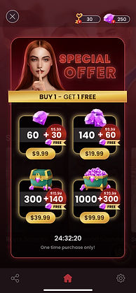
A critical part of the design process involved the continuous iteration of our Sales Pages to maximize revenue while preserving a premium user experience.
We had to account for diverse monetization behaviors, designing clear interfaces for four distinct models: allowing users to wait for free rewards, collecting daily rewards, making a one-time purchase of gems/keys, or opting for a recurring subscription model.
The design challenge was ensuring that all these different offers maintained a premium look and used a highly visible information hierarchy to clearly articulate the value proposition. This focus on clarity and choice empowered users to quickly compare options and easily understand exactly what they were getting, thus selecting the model that best suited their budget and play style.
Strategic Sales Page Iteration
Continuously designing and refining sales interfaces to strategically support four distinct revenue models (subscription, one-time, daily rewards, and free waiting) for maximum LTV.
Premium Offer Visibility
Designing complex purchase options across all models while maintaining a sophisticated, premium aesthetic and a clear information hierarchy for transparent value articulation.
Empowering User Choice Architecture
Creating clear, high-quality interfaces that allow users to easily compare and select from diverse models, effectively matching purchase decisions to their budget and play style.


Adding One Time Purchases
The one-time purchase with a refill after wait model was designed to offer players a critical point of flexibility, balancing immediate gratification with long-term retention. Users could make a single purchase of keys or gems to bypass the wait time and continue consuming content instantly. This system provided a revenue stream from our Strategic Spenders (Maya), while ensuring the free time-gated refill kept our High-Frequency Readers (Olivia) returning daily, maximizing overall engagement across both user segments.
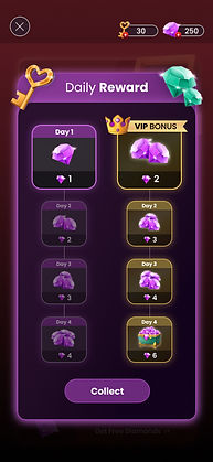
Daily Login Bonus
The Daily Login Bonus feature was a core retention tool designed to incentivize habitual app return and reduce churn. We leveraged this mechanic by presenting two clear reward tiers: the Standard Free Tier and the Premium VIP Tier. The design focused on creating a clear visual contrast, utilizing the app’s gold and premium accents to boldly showcase the significantly higher volume of gems and keys available to subscribers. This tiered system was essential for engagement across our user segments: the free daily bonus kept the High-Frequency Reader committed to returning, while the substantial bump in rewards provided a compelling, visually strong incentive for the Strategic Spender to convert to a VIP subscription.
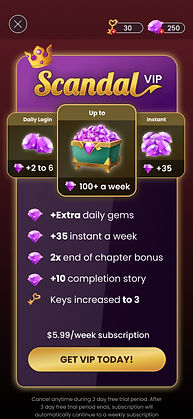
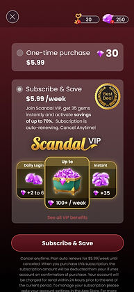

VIP Subscription
The VIP subscription was our highest tier, built specifically to target the Strategic Spender and drive stable, recurring revenue. It offered major incentives like more daily gems and keys, access to exclusive bonus stories, and permanently reduced waiting times for new chapters. To make the membership feel truly premium, we integrated the VIP status directly into the UI with a distinctive gold and purple badge, making the subscriber feel immediately recognized and rewarded throughout the app.
Special Offers & Seasonal
We strategically used Special Offers and Seasonal Promotions (like Valentine's and Christmas) to create urgency and boost revenue during peak times. The design goal was to blend festive, temporary themes with our core premium aesthetic. These time-limited events featured massive bundles of gems and exclusive content, which we promoted using highly visible countdown timers. This approach effectively converted both our Strategic Spenders and tempted our High-Frequency Readers to purchase immediately.


Final Thoughts
Looking back, the Scandal: Interactive Stories project was definitely a success - we hit over 100,000 downloads and saw great results when the app was actively advertised.
Although the application is currently undergoing maintenance before its next big update, this entire project was an absolute game-changer for my career. Diving into that startup environment and handling the process from start to finish was an invaluable masterclass.
It proved I could lead both creatively and strategically, teaching me so much about essential skills like time management, deep UX research and design, effective Art Direction across teams. It also showed me the sheer effort involved in taking a product from concept to launch.